
Designing a responsive
web app
Overview
The number of recipe products available on the web is astonishing. There’s been a home cooking revolution! As more and more people are using digital rather than paper sources to stay up to date on news and sports, so too are people turning to the web for recipes rather than using traditional cookbooks. For a number of reasons, this is a more convenient approach—you can easily take your phone to the store when buying ingredients, or over to your friend’s house for a dinner party.
Now, chefs from all backgrounds can choose Chef365, a mobile web app that delivers everyday recipes tailored for everyday people with a busy lifestyle. You can leave your laptop on your kitchen table when working through the list of instructions, and you can browse recipes with literally any device, anywhere.
The Problem
There’s a large number of digital recipe products on the market that are offer great content but lack simplicity when searching and save recipes. This results to an overwhelming and time consuming experience for users. With a problematic experience, users will leave and search elsewhere.
The Solution
To solve this problem, I designed Chef365, a responsive recipe web app that helps users to find easy to follow and recipes based on varied types of needs. Chef365 offers a simplified way to explore new recipes along with recommendations based on a user’s profile..
My Role
User Research & Analysis
Persona Creation
Wireframes
UI Design & Prototyping
Usability Testing
MVP Definition
User Research
The 5 W's
WHO
Who are you designing for?
Users of recipe apps and cooking enthusiasts who search online for recipes
WHAT
What kinds of tasks and goals will your audience be accomplishing as they use your website or app?
Finding recipes, saving recipes, sharing recipes and following preparation instructions
WHEN
When will your audience be engaging with your product?
When planning and preparing meals
WHO
Who are you designing for?
Users of recipe apps and cooking enthusiasts who search online for recipes
WHY
Why is your audience choosing to use what you’ve designed and what drives this behavior?
Users find this design easier to use and take less to navigate to their preferred recipe content
Hypothesis
Cooking enthusiasts who search online for recipes and users of recipe apps want an easy way to plan and prep their meals. It’s important that they have a web app that allows them to find, save and share recipes with easy preparation instructions. Using the app will typically take place in the kitchen when preparing food, in the store when purchasing ingredients, and at home when researching meal options.
User Interviews
Meaningful insights and their significance to how they might impact my app. Here are all the interesting details, patterns, or comments that I’ll keep in mind as I design:
Were there any patterns that emerged from the answers?
-
All participants used social media for recipe inspiration
-
Visual photos were a key tool used during searches
-
All participants mention simple and minimal design would be best
-
User reviews were essential when selecting a recipe
Was there anything that surprised you/was an outlier in the answers?
Two of the participants weren’t as interested in videos as they were with clear instructions and ingredients
Noteworthy quote(s)
-
“I’m a busy mom and I don’t have a lot of time searching for recipes“
-
“It’s really important for me to support local restaurants and chefs“
-
“Recipes can have a good synopsis but should not be too long. They should be straight to the point.”
Were there any frustrations mentioned?
All participants shared how navigating through most sites consumed a lot of their time. They prefer an experience that is simple and straight to the point without a lot of commentary about each recipe.
Were there any needs or goals the participants mentioned?
-
To quickly capture and bookmark recipes and the ability to easily find them
-
Having the ability to adjust prep instructions based on family size or dietary needs
-
The ability review/read instructions while cooking on a lock screen
User Personas
Persona One
Persona Two
Persona Three


User Stories
User Story One
When I am searching for a recipe, I want to be able to filter my list by cooking times so I can prepare a meal that fits my busy lifestyle.
Needed Features
Advanced filtering options
Rationale
To make it easier for the user to filter recipes based on their dietary needs.
User Story Two
When I am viewing recipes, I want to bypass the story or bio so I can quickly read the recipe’s instructions.
Needed Features
A tabbed menu that allows users the option to choose between the recipe stories, instructions, ingredients, and reviews.
Rationale
This allow users to quickly access instructions and ingredients.
User Story Three
When I am viewing recipes, I want to be able to save or like it so I can access my saved recipes later.
Needed Features
Having the ability to save recipes as a favorite for later access.
Rationale
To make it easier for the user to view liked recipes or save recipes to prepare for later..
User Flows
With so many key features that will set Chef365 apart from its competitors, I combined all three user stories into one task.
Success Criteria
Filtered search results
Quick way to ingredients
Save recipe to favorites
Entry Point
Home Screen
Task List
1. Home Screen
2. Filter Options
3. Filter Search Results
4. Recipe Ingredients
5. Recipe Reviews
6. Sign In
7. Add to Favorites
Requirements From User Story
Advanced Filtering Options
Recipe Menu Tab
Like/Favorite Button

Wireframes
After developing user flows, I began sketching ideas and creating low-fidelity paper mockups. Then I refined sketches into mid and high-fidelity mockups.
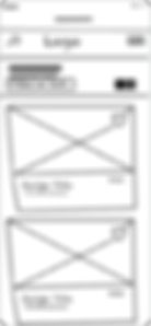
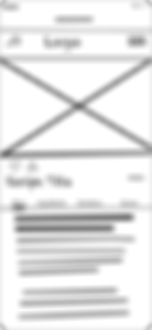
Low-Fideltiy
Low-fidelity wire frames drawn on paper
Home
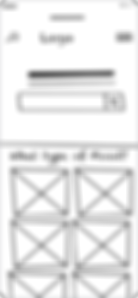
Filter Options

Filtered Entered

Filtered Recipe Feed
Recipe/About
Recipe/Ingredients

Recipe/Directions

Recipe/Reviews

Usability Testing Results
The usability testing score provided great insight into how I should execute Chef365’s key features. Most of my results were minor cosmetic adjustments. There were a few items below that I missed, which would take a lot of work to correct. One big takeaway was most of my test users were very visual. For future projects, I need to consider testing my design at the mid-fidelity stage of my design process.

0 = I don’t agree that this is a usability problem at all
1 = Cosmetic problem only: need not be fixed unless extra time is available on project
2 = Minor usability problem: fixing this should be given low priority
3 = Major usability problem: important to fix and should be given high priority
4 = Usability catastrophe: imperative to fix before product can be released
Mid-Fidelity
Mid-fidelity wire frames designed in Sketch
Home

Filter Options
Filtered Entered

Filtered Recipe Feed

Recipe/About

Recipe/Ingredients

Recipe/Directions

Recipe/Reviews
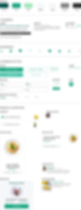
High-Fidelity
High-fidelity wire frames designed in Sketch
Home

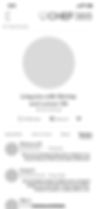
Recipe Details

Recipe Reviews

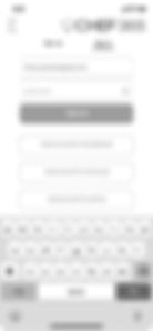
Sign Up
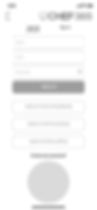
Sign In
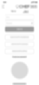
Sign Credentials
Added to Favorites
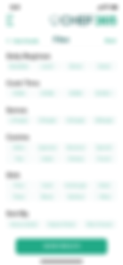
Filter

Selected Filter Tags

Filtered Results

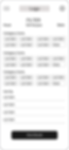
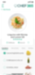
Recipe Ingredients

Recipe Instructions

The mood board helped define the visual direction for Chef365. It was contrasted from a combination of the user research, visual inspiration from various design sites and a competitive analysis of popular recipe websites.
Mood board

Final UI
Final UI was further refined in Sketch and I applied Chef365’s branded style guide.

Filter
Selected Filter Tags

Filtered Results

Recipe Ingredients
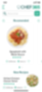
Home
Recipe Instructions

Recipe Details

Recipe Reviews

Sign Up

Sign In

Sign Credentials

Added to Favorites

Responsive Break Points
Style Guide

Final Takeaways
I chose this project because I wanted to learn how people think when it comes to cooking and seeking out recipes. This isn’t an area of my expertise, so I thought this would be a great opportunity to approach this project with a fresh pair of eyes and ears and design a solution with no personal bias.
Roadblocks
One roadblock that I encountered was my user interview running over time. I overcame this by reminding myself how much time we have during our interview.
Another roadblock was designing for the different breakpoints. I overcame this by studying the design layouts at media queries.
What I Learned
During my process, I learned valuable insights from my research and testing. These insights had the biggest impact on my final design:
-
I added a ‘back to recipe’ link to the ingredients screens.
-
I made the ingredients the first tab on the recipe detail screen.
-
I used large food imagery for all the recipes.
Functionality and features were decided by my findings from performing a competitive analysis, user interviews and usability testing.
What I Would Do Differently
With great success, I was able to implement a design solution that met the needs of the users that I targeted. I am happy with the overall look and feel.
There were some aspects of this project that I would do differently:
-
I would consider perfecting my user research script. Once I get a script that works, I can probably use it as a template for future projects.
-
To save time building my project case study, I should consider putting the pieces of my case study together as I’m working through my projects.
-
Another time-saving tactic would be creating a design system that could be used on future projects.