
Designing
AN Online Store
Overview
Sneaker Store connects to young, fashion-conscious individuals through a premium brand experience featuring the best selection of authentic, sport-inspired sneakers. We define this premium experience through our products and the presentation of our brand.
Buying from an online store has never been easier. Users are tired of the complex and unintuitive navigation systems in traditional online stores, so we provide a breath of fresh air with our sleek and dynamic experience. Our modern and clean design and smart filtering options are the major drivers of our success.
The Problem
Users don’t have the time or ability to visit physical stores and would rather buy their goods on the go or from home. Customers prefer convenient ways to perform various tasks that don’t take much of their time.
The Solution
To solve this problem, I designed a native app to meet the needs of Sneaker Store’s customers. With so many online sneaker stores, it will be great to have an app that gives its users a customizable experience with their needs in mind.
My Role
Competitive Analysis
Wireframes
UI Design & Prototyping
Usability Testing
Illustration/Icon Design
Competitive
Analysis
I made it a priority to conduct extensive competitive research and analysis to identify what solutions exist, what’s working for others in the market, and where we might be able to improve.
Nike

Nike

Nike

Nike

Finish Line

Finish Line

Footlocker

Footlocker
Footlocker

Footlocker
Champs Sports
Champs Sports

User Stories
User Story One
As a customer I want there to be a variety of payment options, so that I can choose the payment method that suits me best.
User Story Two
As a frequent customer, I want to see recommendations of products I find like
so that I find items I might not on my own.
User Story Three
As a customer, I want to have access to advanced filtering options so that I don’t have to browse through a lot of products to find what I’m looking for.
User Flows
For this case study, I focused on User Story One.
Success Criteria
Choosing preferred payment method
Task List
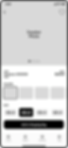
1. Home Screen
2. View Sneaker Details
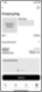
3. Shopping Cart
4. Check Out
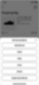
5. Payment Options
6. Add Payment
Entry Point
Home Screen
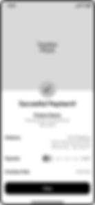
7. Payment Added Successfully
8. Submit Payment
9. Successful Payment!
Requirements From User Story
Payment Options
Add New Payment
Complete Purchase

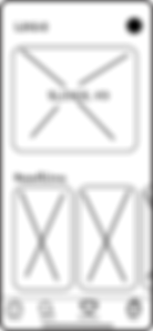
Wireframes
After developing user flows, I began sketching ideas and creating low-fidelity paper mockups. Then I refined sketches into mid and high-fidelity wireframes.
Low-Fidelity
Low-fidelity wire frames drawn on paper
Home
Recommend Sneaker Details

Shopping Bag

Check Out

Add Payment Options

Add Credit Card Info

Checkout (Updated Payment)

Successful Payment

Mid Fidelity
Mid-fidelity wire frames designed in Sketch
Home

Recommend Sneaker Details
Shopping Bag
Check Out

Add Payment Options

Add Credit Card Info

Checkout (Updated Payment)

Successful Payment
High Fidelity
I recruited three users to perform the task of adding a Master Card as their preferred payment option. Overall I received positive feedback with only minimal pain points.
Positive feedback:
-
The users felt the design was pretty straightforward.
-
The buttons were clearly recognizable.
-
The task of adding the credit card was clear.
-
Two users commented that having everything to fit on the screen was very helpful.
-
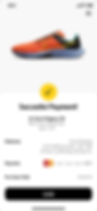
It was a nice touch of adding a product photo with payment confirmation.
-
All the users were excited to see what the final product will look like.
-
One tester liked the idea of having a store specific to only sneakers
Constructive feedback:
-
Adding a numb badge to indicate the number of items in the shopping bag.
-
Adding an X (cancel) with secondary screens.
-
When user testing, it would be a good idea to include bottom icons with the mid-fidelity design.
High Fidelity
High-fidelity wire frames designed in Sketch
Home

Sneaker Details
Adding to Bag Transition


Sneaker Details with Filled Bag
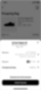
Shopping Bag


Check Out

Add Payment
Options
Add Card Info
(Blank)
Add Card Info
(with Keyboard)
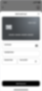

Add Card Info
(Filled Out)
Checkout
(with New Card Info)

Successful
Payment

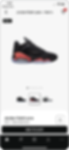
Final UI
Final UI was further refined in Sketch and I applied Sneaker Store’s branded style guide.

Home

Sneaker Details
Adding to Bag Transition


Sneaker Details with Filled Bag
Shopping Bag


Check Out

Add Payment
Options

Add Card Info
(Blank)
Add Card Info
(with Keyboard)


Add Card Info
(Filled Out)
Checkout
(with New Card Info)


Successful
Payment

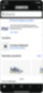
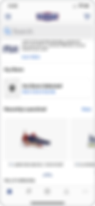
Home Page on Desktop
Style Guide

Final Takeaways
Roadblocks
Overall, I really enjoyed working on this project because it offered a lot of learning opportunities and a lot of room to be creative. The roadblock that I encountered was testing my mid fidelity wireframes. I noticed that users find it easier to perform tasks when a design is fully flushed out. Moving forward, I need to give more detail or communicate that the design is still at its rough stage. However, two of my users had no issues because they assisted with past user tests.
What I Learned
I learned that building a solid UI library will make the design process move quickly. I find that font weights and sizes don’t vary too much on mobile. Typestyles can easily translate to multiple projects. Finally, designing in black and white and not applying color until after user testing speeds up the design process.
What I Would Do Differently
Even though it wasn’t required for this project, my design process should always include personas. This will give the design some personality, especially at checkout. To speed up this process, I can create a reusable persona template and modify based on the project specifications.