Design Systems
Designing a Reusable File Upload Component
Creating a consistent file-upload pattern with clear instructions, interaction feedback, and responsive layouts for an enterprise design system.
Client:
Clearway Health Insurance
Role:
UX/UI Designer
Project Duration:
2 months
What Needed to Be Designed and Why
File uploads needed to accommodate more than selecting a document. The pattern had to communicate file requirements, show upload status, handle errors, and fit within different page layouts.
The challenge was to define a reusable component that supported these needs while remaining consistent with the broader design system.
My Role
I explored visual and interaction treatments, defined the uploader and file-attachment states, and documented component anatomy and accessibility considerations. I also applied the pattern within responsive claims screens to show how it worked in a product experience.
Exploring the Upload Pattern
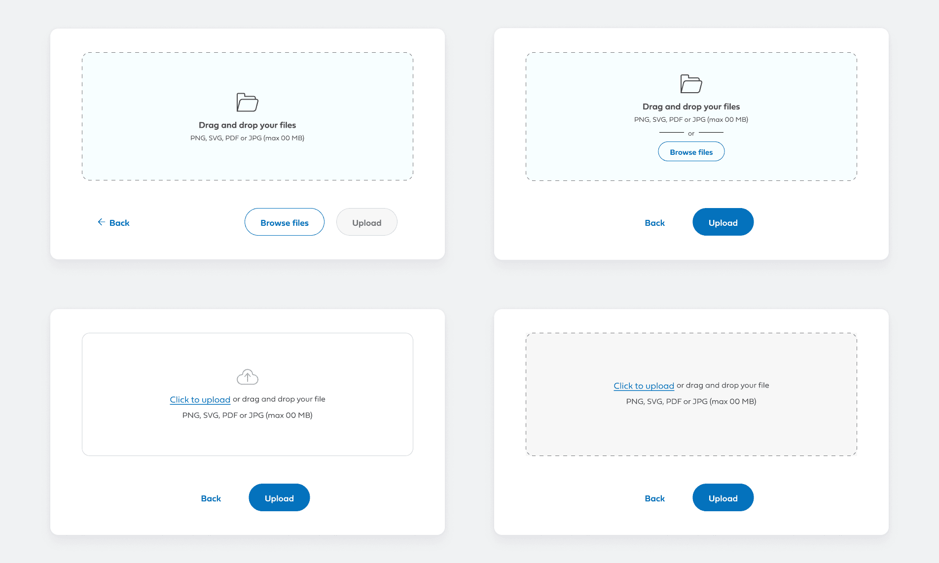
I explored different ways to present the drop zone, file requirements, and upload actions. The concepts compared Browse button placement, inline upload links, and background and border treatments.
These explorations helped refine the visual hierarchy between selecting a file and starting the upload.
One Component, Clear Interaction States
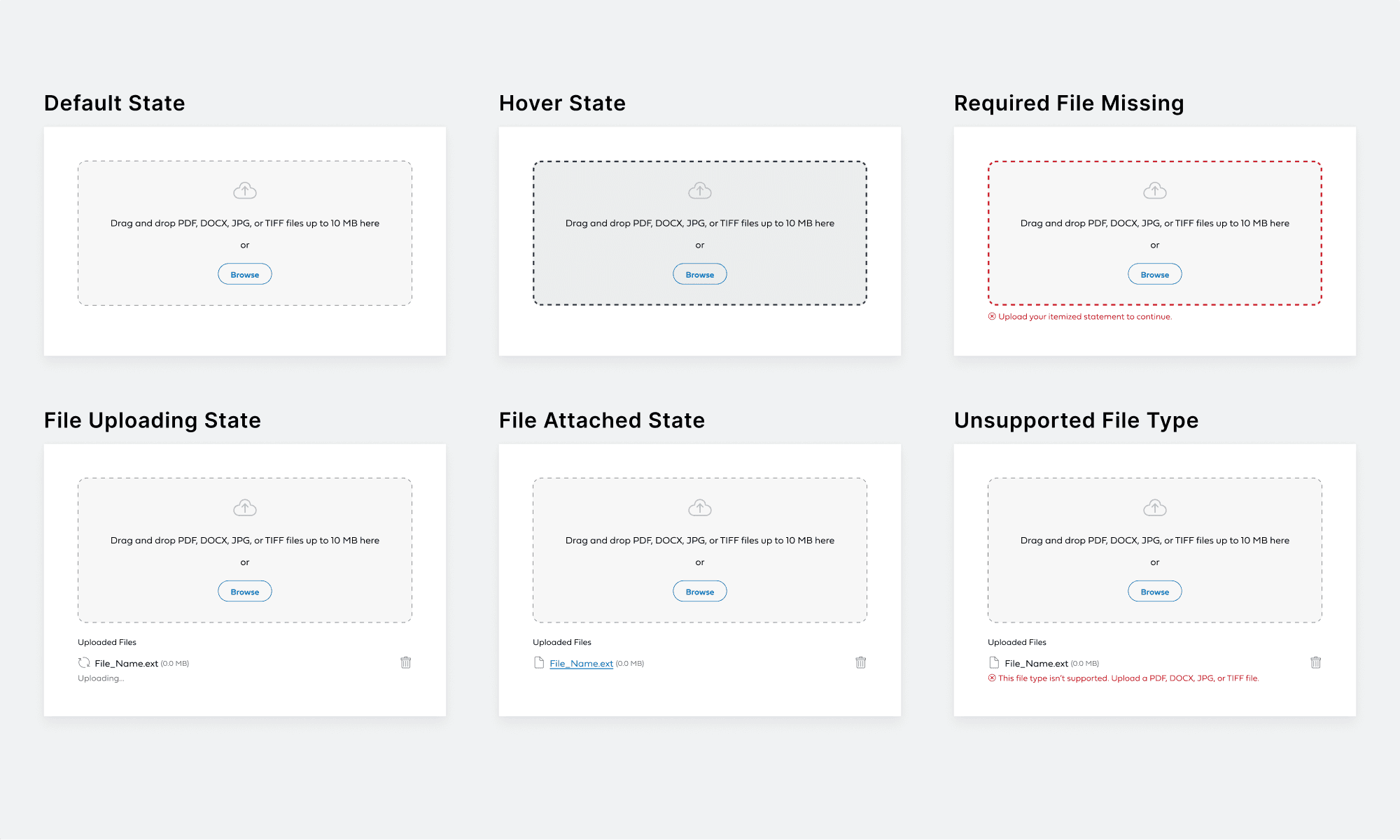
The component used two connected building blocks: a drop zone for selecting files and an attachment row for displaying file information and status.
The drop zone included default, hover, drag-active, focus, and error treatments. Attachment states covered uploading, an attached file, and an upload error, with a control for removing the file.
Together, these states defined how the pattern should respond throughout the upload interaction.
Structure and Accessibility
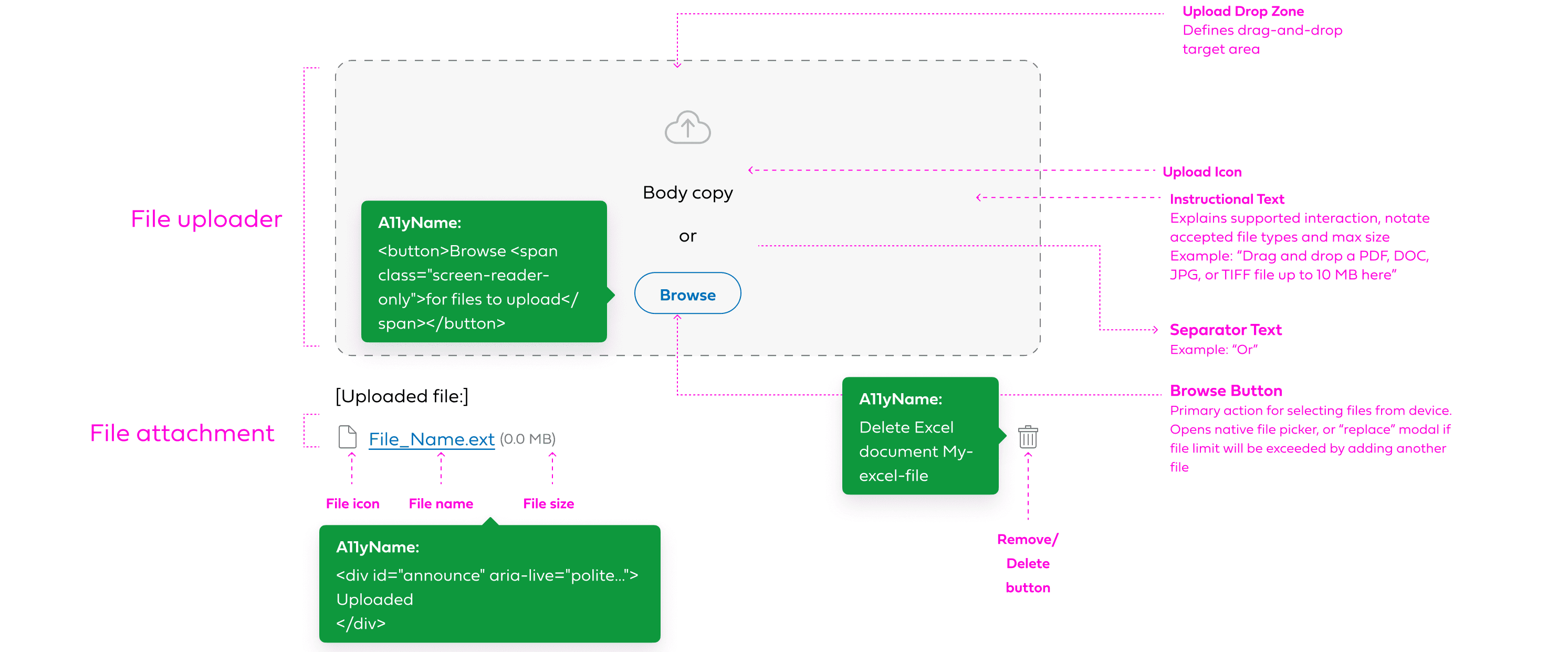
I documented the component’s structure and anatomy, showing how the drop zone, instructions, Browse button, and attachment row fit together. Specifications defined each element’s purpose, accessible names for browsing and removing files, and screen-reader announcements for upload status.
From Component to Product Experience
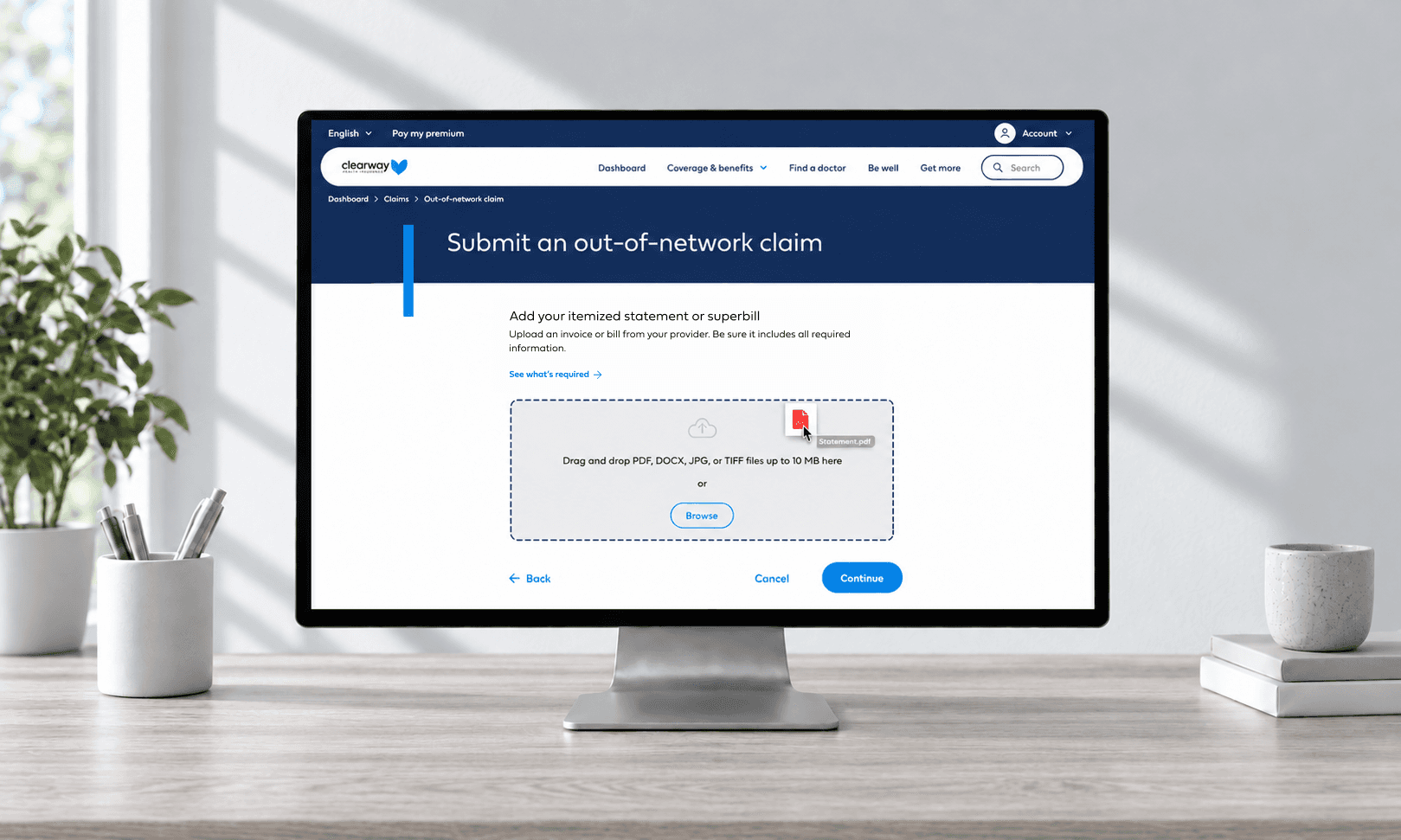
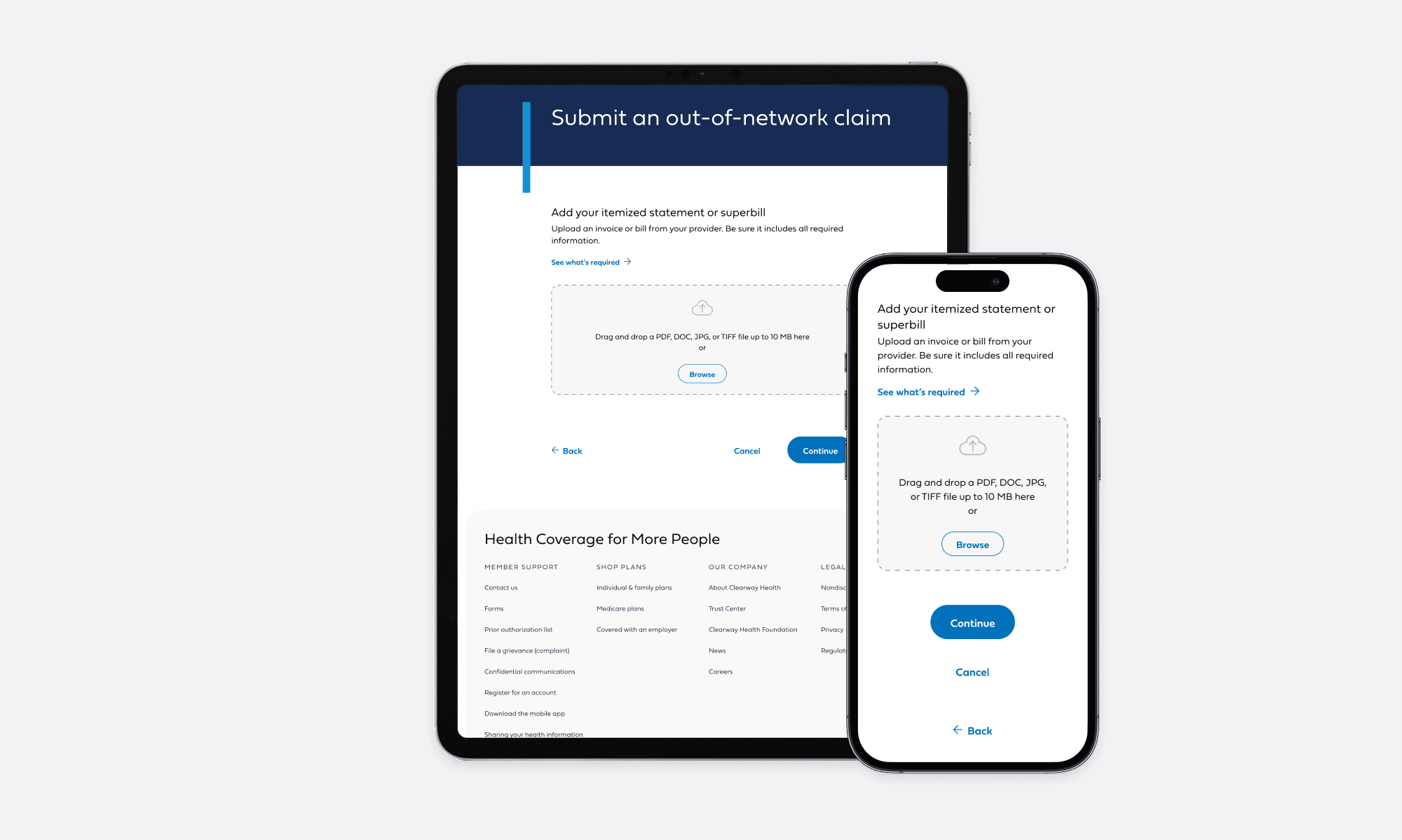
I applied the upload pattern to an out-of-network claim flow, where members add an itemized statement or superbill.
Tablet and mobile layouts show how the component fits alongside instructions and page actions, adapting its spacing and arrangement across screen sizes.
The Final Component
The reusable upload pattern supported claims, optional supporting documents for appointment booking, and Return Transmission File uploads in the Clearway provider portal. Figma properties allowed designers to adjust its size, state, instructions, and attachment visibility for different workflows.
This project reinforced the importance of designing beyond the default state. My contribution focused on making the component’s behavior as explicit as its appearance, giving future implementations a consistent design reference.


More Projects




Design Systems
Designing a Reusable File Upload Component
Creating a consistent file-upload pattern with clear instructions, interaction feedback, and responsive layouts for an enterprise design system.
Client:
Clearway Health Insurance
Role:
UX/UI Designer
Project Duration:
2 months
What Needed to Be Designed and Why
File uploads needed to accommodate more than selecting a document. The pattern had to communicate file requirements, show upload status, handle errors, and fit within different page layouts.
The challenge was to define a reusable component that supported these needs while remaining consistent with the broader design system.
My Role
I explored visual and interaction treatments, defined the uploader and file-attachment states, and documented component anatomy and accessibility considerations. I also applied the pattern within responsive claims screens to show how it worked in a product experience.
Exploring the Upload Pattern
I explored different ways to present the drop zone, file requirements, and upload actions. The concepts compared Browse button placement, inline upload links, and background and border treatments.
These explorations helped refine the visual hierarchy between selecting a file and starting the upload.
One Component, Clear Interaction States
The component used two connected building blocks: a drop zone for selecting files and an attachment row for displaying file information and status.
The drop zone included default, hover, drag-active, focus, and error treatments. Attachment states covered uploading, an attached file, and an upload error, with a control for removing the file.
Together, these states defined how the pattern should respond throughout the upload interaction.
Structure and Accessibility
I documented the component’s structure and anatomy, showing how the drop zone, instructions, Browse button, and attachment row fit together. Specifications defined each element’s purpose, accessible names for browsing and removing files, and screen-reader announcements for upload status.
From Component to Product Experience
I applied the upload pattern to an out-of-network claim flow, where members add an itemized statement or superbill.
Tablet and mobile layouts show how the component fits alongside instructions and page actions, adapting its spacing and arrangement across screen sizes.
The Final Component
The reusable upload pattern supported claims, optional supporting documents for appointment booking, and Return Transmission File uploads in the Clearway provider portal. Figma properties allowed designers to adjust its size, state, instructions, and attachment visibility for different workflows.
This project reinforced the importance of designing beyond the default state. My contribution focused on making the component’s behavior as explicit as its appearance, giving future implementations a consistent design reference.
More Projects
Design Systems
Designing a Reusable File Upload Component
Creating a consistent file-upload pattern with clear instructions, interaction feedback, and responsive layouts for an enterprise design system.
Client:
Clearway Health Insurance
Role:
UX/UI Designer
Project Duration:
2 months
What Needed to Be Designed and Why
File uploads needed to accommodate more than selecting a document. The pattern had to communicate file requirements, show upload status, handle errors, and fit within different page layouts.
The challenge was to define a reusable component that supported these needs while remaining consistent with the broader design system.
My Role
I explored visual and interaction treatments, defined the uploader and file-attachment states, and documented component anatomy and accessibility considerations. I also applied the pattern within responsive claims screens to show how it worked in a product experience.
Exploring the Upload Pattern
I explored different ways to present the drop zone, file requirements, and upload actions. The concepts compared Browse button placement, inline upload links, and background and border treatments.
These explorations helped refine the visual hierarchy between selecting a file and starting the upload.
One Component, Clear Interaction States
The component used two connected building blocks: a drop zone for selecting files and an attachment row for displaying file information and status.
The drop zone included default, hover, drag-active, focus, and error treatments. Attachment states covered uploading, an attached file, and an upload error, with a control for removing the file.
Together, these states defined how the pattern should respond throughout the upload interaction.
Structure and Accessibility
I documented the component’s structure and anatomy, showing how the drop zone, instructions, Browse button, and attachment row fit together. Specifications defined each element’s purpose, accessible names for browsing and removing files, and screen-reader announcements for upload status.
From Component to Product Experience
I applied the upload pattern to an out-of-network claim flow, where members add an itemized statement or superbill.
Tablet and mobile layouts show how the component fits alongside instructions and page actions, adapting its spacing and arrangement across screen sizes.
The Final Component
The reusable upload pattern supported claims, optional supporting documents for appointment booking, and Return Transmission File uploads in the Clearway provider portal. Figma properties allowed designers to adjust its size, state, instructions, and attachment visibility for different workflows.
This project reinforced the importance of designing beyond the default state. My contribution focused on making the component’s behavior as explicit as its appearance, giving future implementations a consistent design reference.